One system, eight identities
A Japanese construction company ran every department on paper and disconnected office tools - Word, Excel, PowerPoint. The goal: one shared platform, eight departments, each still its own space inside it.
At a glance
Turned eight departments' worth of paper and spreadsheets into one shared platform - one component library, one color architecture, one system built to hold as the departments using it kept growing.
The system
Context
Every department - sales, construction, management, design, and more - ran on paper records and whatever office software was on hand: Word for reports, Excel for tracking, PowerPoint for presentations. Each department had built its own habits around these tools over years. The goal was to bring all eight departments into one shared SaaS platform - but flattening them into a single visual identity would have erased what made each department's workflow legible to the people who used it every day. The platform needed to feel like one system and eight distinct spaces at once.
Role & Team
I led a three-person design team and owned the design system end to end - its foundations, its components, and how it evolved as new departments and screens were added. Where a solo designer can hold every decision in their head, a system meant to outlive any one contributor has to be legible enough for three designers to build on consistently.
That legibility lived in Figma as real documentation - every department color, size, and state specified for build, not left for a designer to infer from a swatch.
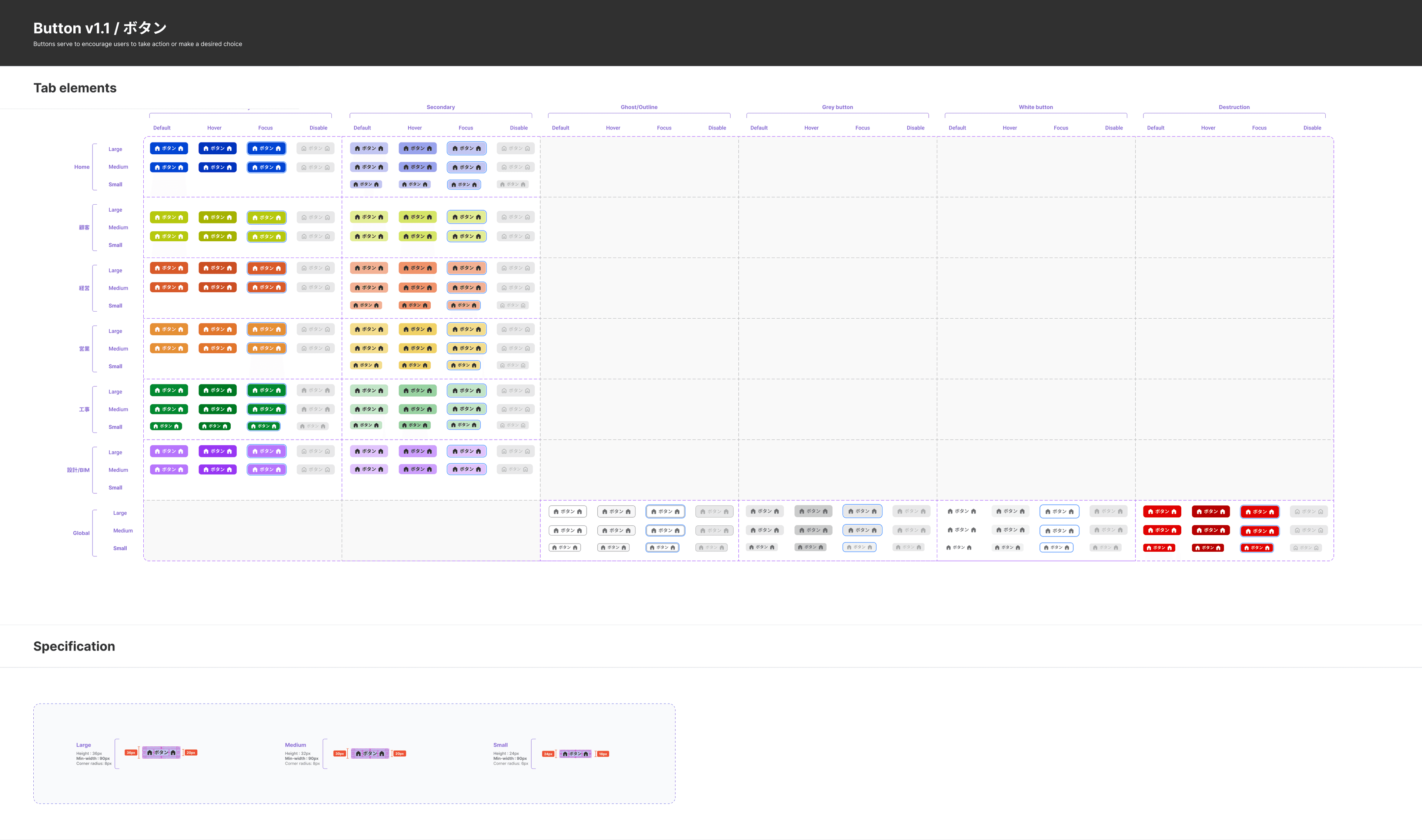
Button documentation - six department colors × six button types × three sizes × four states, plus the global-use variants, in one reference.
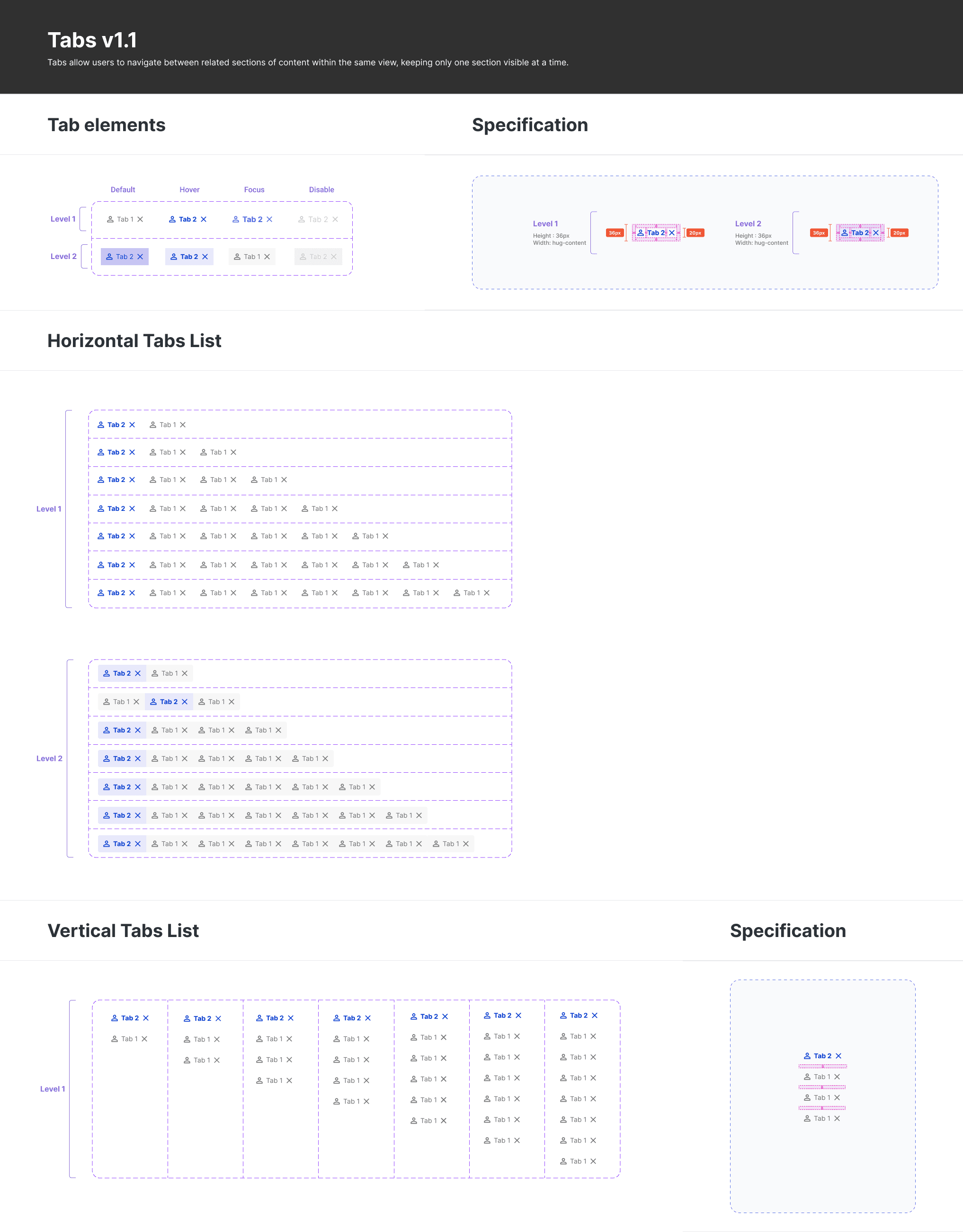
Tab documentation - both hierarchy levels, every state, and the horizontal and vertical list variants each department screen could call on.
One platform, many identities
The Challenge
Eight departments needed to live inside one shared shell without losing what made each of them feel distinct. A single accent color per department wasn't enough on its own - each color had to keep working everywhere it would actually appear: as a light background, as a dark active state, as body text, inside a button, across every interactive state - and still meet WCAG AAA/AA contrast requirements.
The Approach
Each department was assigned a hue, then built out as a full ten-step scale, not a single swatch - every step graded against WCAG AAA/AA contrast so the color held up whether it sat behind white text or against a light card. The department identity lived in the scale, not just the accent.
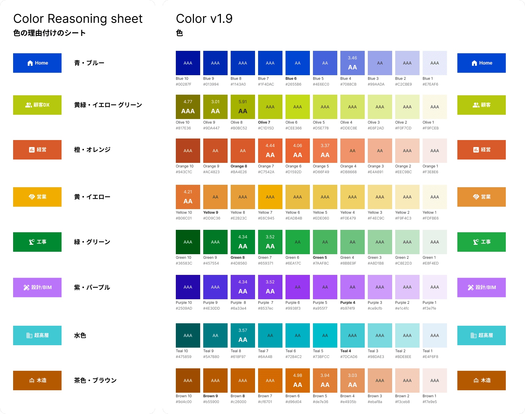
The first color-assignment proposal (left) and Color v1.9 - the approved ten-step scale per hue, with WCAG AAA/AA contrast grading built in (right).
Designing for whom?
The Challenge
The people using this platform were construction-company staff with an average age of about 45, some in their 60s. The reasonable-sounding assumption was that older users would want a bigger, more spacious interface, so the first version shipped generous type and spacing. The feedback that came back asked for the opposite - users wanted things more dense, not less.
The Approach
Talking directly with users surfaced two separate reasons, not one. First, Japanese readers are already used to reading their language at a smaller, denser size - closer to how a newspaper sets type - so Western-SaaS spaciousness read as inefficient rather than considerate. Second, and unrelated to age or reading habits at all: the interface had been designed at a 1920px canvas, but the actual desktop screens in the field were smaller, so the scale from design to real screen was already off before density was ever a question.
The approach was to test it directly: the same screens rendered across both desktop widths and all three text scales, side by side. This wasn't only to see how each combination looked - it was to build an overall understanding of how size and spacing would scale together before committing to the resize.
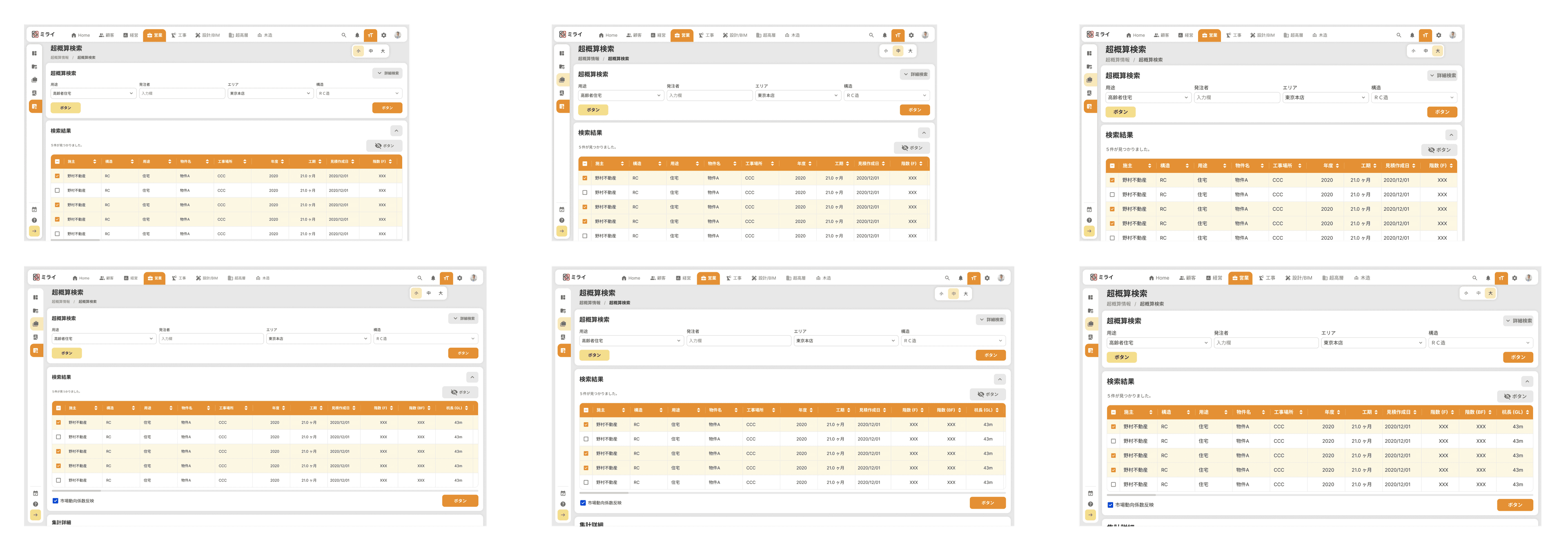
Two screen sizes (1280px and 1536px) and three text scales, tested before the resize shipped (menu closed - menu open/closed was tested too, not shown here).
The whole system went through a resize, shipped as a versioned update with its own changelog: buttons, icons, and text all stepped down a size across the board. And because even a 45-to-60 age range doesn't share one preference, the platform shipped a small/medium/large text-scale control, so people could set their own density instead of the system assuming one answer for everyone.
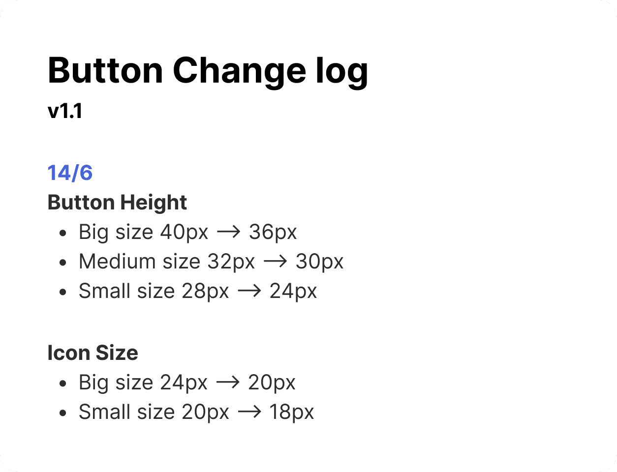
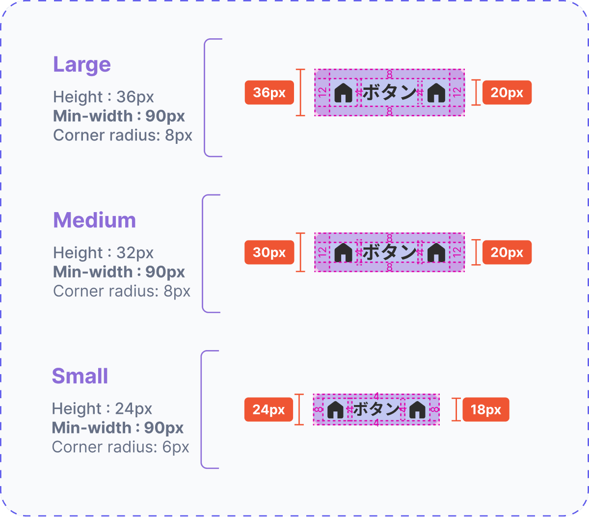
The result: sizing smaller than the common standard.
Outcome
After testing, the client approved the redesign without additional revision cycles - and the design system it was built on became the foundation for the modules that came after.
Leading three designers on a system this size meant the color architecture and the resize both had to hold as new departments and screens kept getting added - not just work once. The department colors kept their contrast and identity wherever they showed up, from search screens to shared views. The density fix shipped without breaking what the platform's existing users already depended on. That was the real test: not whether the system looked right on day one, but whether it kept holding as everything built on top of it.
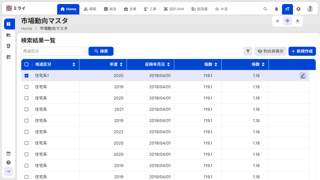
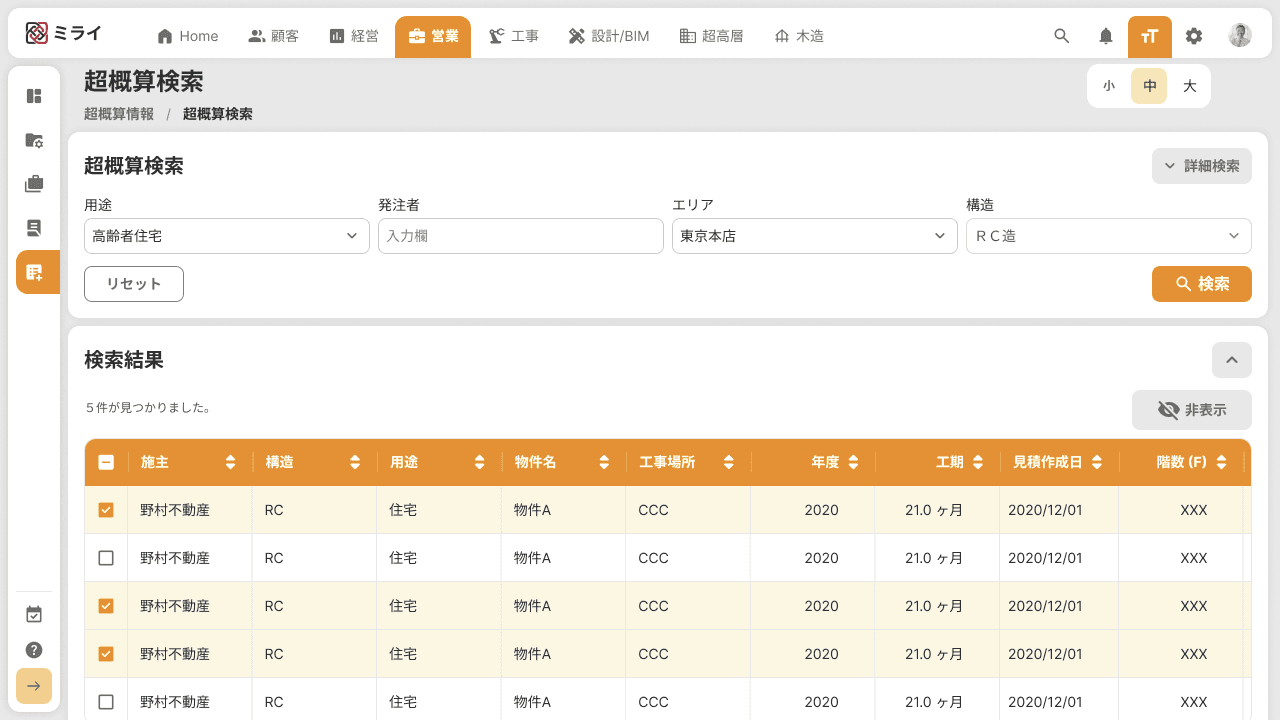
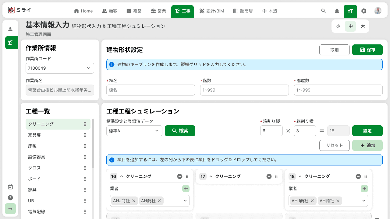
Applied across Sales, Construction, and the shared Home view - three colors, one component library underneath.